
 Muse
MuseRug-Burn Mar 22nd, 2007
 I was looking through the newest Communication Arts (March/April) and I saw a piece with a floral like design. It was very interesting to see how the design contributed to the space and brought the piece together. I started to ponder where else I had seen this design before. I could not stop thinking about this ugly couch that I had in college. It was the ugliest and most uncomfortable couch I had ever sat on; the kind where, when you sit down, your knees are higher than they were before you sat down. Why, if ornate designs conjure up memories of gross old carpet, are we not turned off by it in design?
Ornate design makes for an interesting and subtle composition when used the correct way. A warm blue or a soft pastel red can come across very playful and help lead the eye through the piece. Almost any pastel causes the floral to disappear from a distance, but creates a nice cohesive piece up-close. The question that I really want to address, however, is why does this not come across as corny, old, or dirty? There is something that is clean and elegant about this kind of design. I think the answer lies in English family crests.
Ever since Queen Elizabeth and her elegant nature, designs containing gold and floral have been seen as extravagant. Many movies portray her in vibrant red or purple cloth with a floral/ornate design. 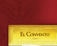 Take a look at El Convento’s website to see an example of a high-class restaurant. Just by applying this design to the background and making it a deep red, we get the impression that this is a really fancy restaurant. This website looks elegant simply because of its “expensive red” and serif text. After looking at other designs, we can see that floral elements are often extrapolated even further. The color does not matter. Somehow our minds have thrown the ugly couch reference out the window and this has become something in a design that works nicely.
I have not attempted to use this as a design solution yet, but after exploring some print and websites that use this, I can see that this is a viable element to integrate into almost any piece. Whether elegant or explosive, it works great as a texture in the background and can even be brought forward to accentuate a font or image. Thank you Queen Elizabeth.


 View All