
 Muse
MuseThin Line of Contrast Jan 10th, 2007
One of the most recent webtrends seems to lie in the high contrast button or bars that are popping up all over the internet. This makes me wonder if following web trends has any benefit to a website. You will find websites all over the internet, some suggesting that you change the design of your site once every 6 months, where as others suggest that you change your site gradually overtime to make your visitors comfortable with gradual change. The decision seems to come down whether or not you should follow the trends in webdesign.
 This high contrast bars behind title bars, links, buttons or even just standalone images has exploded onto many popular webpages. I would consider this a trend that will not last long. While it is a good design element for grabbing attention and catching the eye, it will soon not have the same effect on people. I have even seen this trend make its way into commericial ads and even a hint of it in the new Apple IPhone. I will admit, with my design, I follow trends. It makes customers happy, and they like to see visual ramblings of everything else they have been seeing. I say use caution and keep these three questions things in mind.
Will it withstand time?
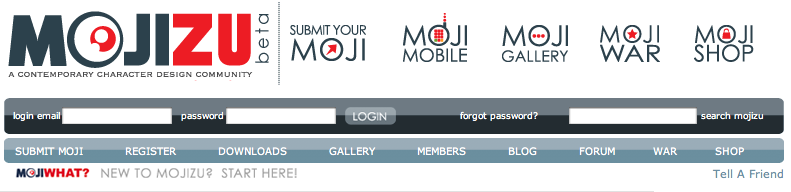 Mojozu is a website wtih design based around high contrast. The site has a fresh feel. I am curious about the future of this trend. Will it still work a year from now? Will that design be so heavily used that Mojozu will no longer be fresh? For large websites, this may not be a problem because they have a full-time staff that can change the design at anytime. However, for smaller clients that can?Äôt afford a website change every year, these trends need to be used with caution.
Have I seen it too much?
This one is simple. If you see the design all over the internet already you are probably too late. The elements have already made their wow factor and people coming to your site are going to be no more impressed with your trendy layout than they were with the last 100 sites that use the same techniques. Don’t jump on the bandwagon if everyone else has already been on it and is jumping off.
Does it fit MY design?
This one is key. DON’T use it just because it looks cool. There is no reason to use these high contrast buttons if they don’t fit your site. I am reminded of amatuer sites with a lot of javascript effects, things flashing, and images all over the site that have beened gathered from other sites. Too much of a good thing applies here. If the trend fits right into your design it can work great. The worst thing to do is force a bad design element into a good site. Design comes first. You may even need to remind your client of this sometimes, if at all possible. They are going to want that glamour and shine. Explain to them why it may not be the best choice.
Conclusion
Just be careful. Websites don’t win awards by just being flashy. They get awards from the solid design and funciton that is built around the flashy things. Watch for trends, and use them wisley.


 View All